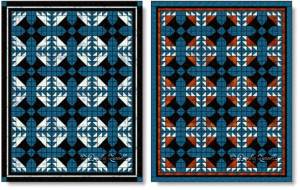
My first block was designed using only three colours, but I thought it was a little drab, so I decided to add the bright orange --the complementary colour to the blue. By using a little of this colour, it gives the block just the spark it needed. (However, if your goal is to create a more subtle colour palette, then the choice on the left is the one for you.)
 |
| Blueberry Compote quilt blocks |
Below I have used both blocks to create the sample quilts. The first selections show the quilt blocks set side by side in groupings of four blocks. Rotations by 90 degrees of some of the blocks in each group, results in a quilt with a secondary pattern appearing.
 | ||
| Quilts designed with the BLUEBERRY COMPOTE quilt block. Side by side block setting |
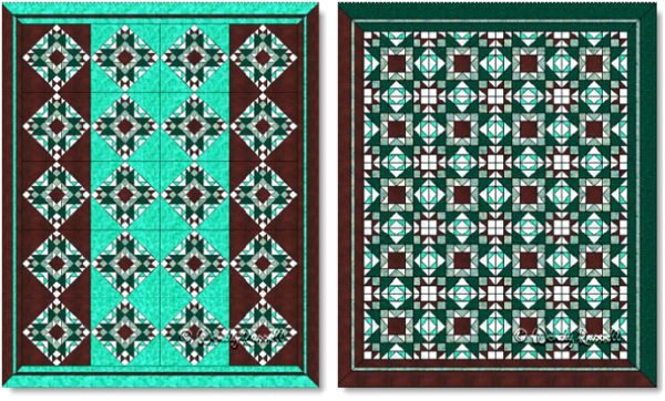
This second set of quilts uses the quilt blocks set on point. Several blocks are also rotated to once again utilize the directional nature of the blocks, and create an entirely different quilt design.
 |
| More quilts designed using the BLUEBERRY COMPOTE quilt block. On Point block setting |
All images © W. Russell, patchworksquare.com
This website uses cookies. By using the services and products of this website, you agree to our use of cookies. Learn more ...


